adammrx
New Member
Dear fellow affiliate lovers!
I just started promoting an affiliate offer both on FB and Google Ads with no results so far.
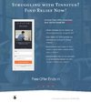
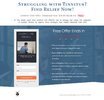
Im promoting a health supplement product called Zeneara, for people with tinnitus. I created an eBook and also put my affiliate link for Zeneara in one of the article inside my ebook. I made 2 different landing pages where im giving it away for free, see the attached files.
I know its close to nothing, but i got 150 clicks without a single sign up for my free eBook. The ads get around 6% CTR on Fb and 3% on Google, which i guess means not too much, since the low number of views so far. I just wanted to make sure if im doing everything right, since i feel i should have gotten a few free sign ups at least already.
Also, when they subscribe and click on the download button, the site will be redirected to the Zeneara product, so there is a chance they see it immediatly after opting in. Should i keep it like that or is it pointless?
Any advices are welcome.
Thank you for reading it,
Wish you all good sales
Adam


