The Most Active and Friendliest
Affiliate Marketing Community Online!

“Adavice”/  “CPA
AdCombo

Official AdCombo

adcombo_post_82175_peru_address_cover_en_1200x630.jpg


Want to be a profit-catcher, but some of your orders keep flying to the Trash statistics column?

To reduce such unpleasant situations, we’re sharing the post that has been
co-created with our trusted advertiser in Latin America.

Taking
Peru as an example, he explains the structure of the country’s administrative units that will help you fine-tune your targeting, along with one of the main problems of Trash orders: wrong numbers. Spoiler: He also advises on how to avoid this.

The content will be especially useful for those who create landing pages on their own and drive traffic to offers in Peru yet get confused by the targeting. It also will be surely useful for those who are in search of a new converting GEO for Nutra.


adcombo_post_82175_peru_address_card_en_1200x630_01 (1).jpg


adcombo_post_82175_peru_address_card_en_1200x630_02.jpg
adcombo_post_82175_peru_address_card_en_1200x630_03.jpg


adcombo_post_82175_peru_address_card_en_1200x630_04.jpg


adcombo_post_82175_peru_address_card_en_1200x630_05.jpg


Enjoy the post and hold a Peruvian profit-bird tighter!
 
Three case studies from LATAM. Campaign optimization tips and personal experience

1200x630.jpg

Time = Money. We’ve combined the most helpful tips of three affiliate case studies from Latin America. So you can read one article and get three times the benefits! The cases participated in the LATAM case study contest and won prizes!

There’s a lot to learn from aff colleagues. The ROI of one of the cases is almost 200%, and the profit is more than $35,000! In this article, you’ll find: how to choose an offer, optimize a campaign, make creatives, and much more.

Don’t waste a second! Open your notes and write down the tips ;)

Case study #1

Beauty offer in LATAM with Facebook and a $35k net profit

Offer: Rechiol in Latin America

Geo: Mexico, Peru, Colombia, Guatemala, and Chile

Period: 2022 (from 01/01/2022 to 31/12/2022)

Landing: Below in the text

Prelanding: None

Traffic source: Facebook ads

Revenue: $54,636

Spend: $18,759.57

Profit: $35,876.43

ROI: 191%

For a long time, this offer has been among regional Top offers. Also, the manager for Latin America, Maria, approved the selected product as the most suitable. Moreover, the ads with the product were rarely seen on Facebook. Those three factors helped our affiliate made up his mind about the offer.

*AdCombo tips: if you use spy tools, don’t launch campaigns with popular offers. Try to find something non-mainstream!

Generation of creatives was the first step to the campaign launch. The affiliate found a freelancer on the Fiverr platform who made a promo video for the product for $25. Also, he hired a designer to create images. Looking ahead, we can say that $25 has been a great investment!

The author of the case study notes it is important to delegate tasks, but it leads to extra costs. If you want to save money, Canva is a great service for creating and editing images (we suggest you consider it if you haven’t tested it yet).

Let’s move on to the campaign launch. Our partner didn’t specify the interests of the target audience, thus, didn’t cut the number of potential leads. The target audience wasn’t segmented by age, interests, and gender.

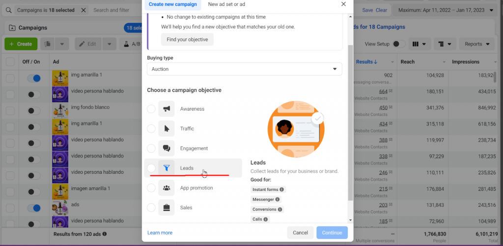
And the objective of the campaign was “Leads” :

%D0%9A%D0%B5%D0%B9%D1%81-%D0%BB%D0%B0%D1%82%D0%B0%D0%BC-1.png-5-1-1024x501.png

Our affiliate admits that he still gets thousands of conversions per week by following this strategy.

A limit of $10 per day was set to optimize the campaign. He also used Ad set Budget Optimization – ABO, for groups of ads. This optimization divides the budget equally among all the ads, which allows us to see which ad is converting better and determine which ad is more suitable for scaling.

Then, our partner chose the following strategy: he turned off ads that had a very high CPA i.e. over $3, and once he got 50 conversions, he increased the CPA every 3 days by 20% – 50%.

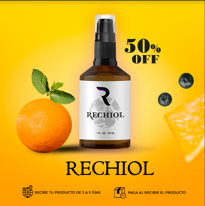
The most successful creatives:

Picture:

%D0%9A%D0%B5%D0%B9%D1%81-%D0%BB%D0%B0%D1%82%D0%B0%D0%BC-1.png-6-1.png


%D0%9A%D0%B5%D0%B9%D1%81-%D0%BB%D0%B0%D1%82%D0%B0%D0%BC.-7-1.png


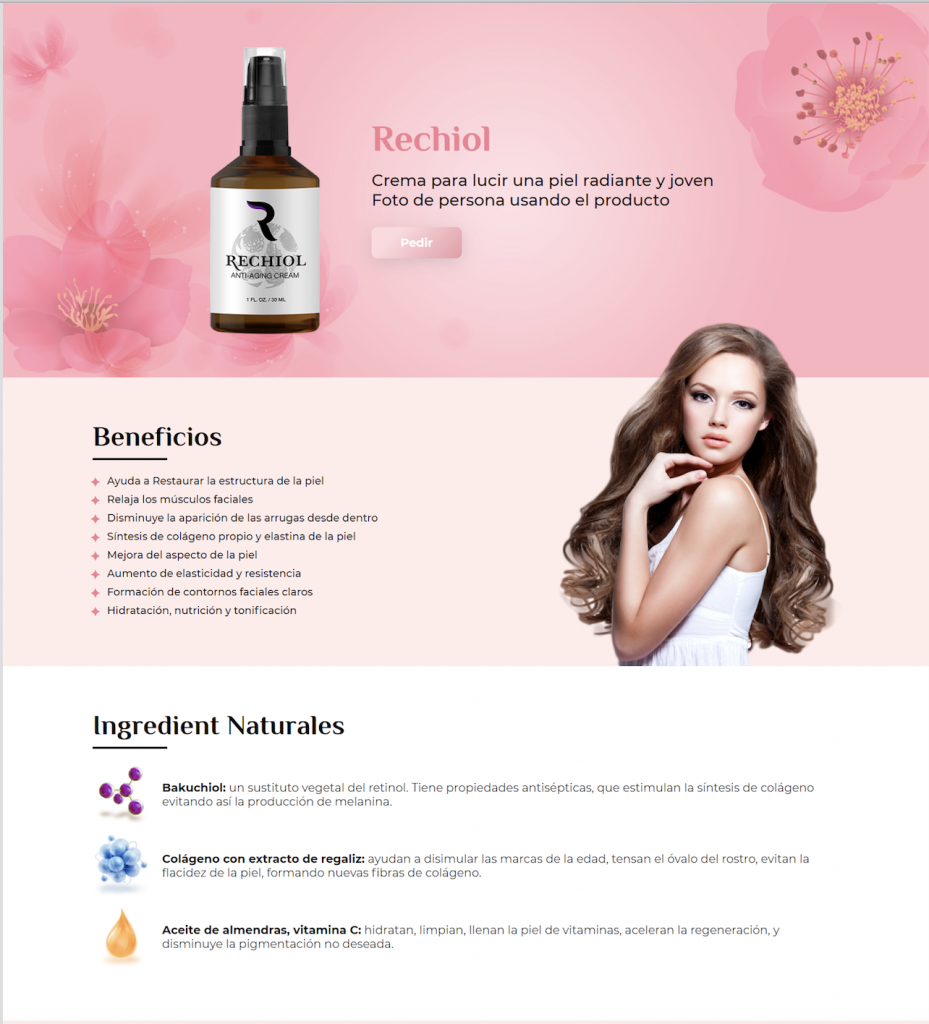
Screenshot of a landing page:

%D0%BA%D0%B5%D0%B9%D1%81-8-1-319x1024.png


*AdCombo comment: For this campaign, our affiliate used a landing page he made himself. His approach is completely clear: no pop stars, people in white robes, etc. It looks more like the product page of a classic facial care product.

It’s okay with the optimization, but how did he scale up the campaign?

The author created other campaigns with minor changes in the creatives. For example, he changed their background colors. While the video remained the same. By the way, the images brought the best results. However, he recommends using video in advertising campaigns for better performance.

:cool: Lifehack: Conversions from images is cheaper than ones from videos. Combining video and images makes Facebook squeeze results from the cheapest ad – the image as the author mentioned.

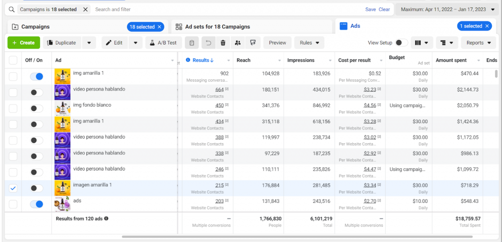
Spend:

%D0%BA%D0%B5%D0%B9%D1%81-9-1-1024x495.png


*AdCombo comment: note that the spend of this ad account is over $18,000. That’s the result of a white hat approach.

Conclusion: If you want to launch a long-lasting campaign, use white hat approach ;)

And it’s time for us to move on to the second case study!

Case study #2:

The Beauty Offer in Mexico via Facebook and a profit of $4.6k+

Offer: 28527 Rechiol – MX (the offer is in stop now, to find a suitable analogue, contact your manager)

GEO: Mexico

Period: 01/08/2022 until 16/11/2022

Landing: Below the text

Prelanding: None

Traffic source: Facebook ads

Revenue: $9117.50

Spend: $4431.34

Profit: $4686.16

ROI: 106%

Just like in the previous case study, it all started with the choice of an offer. The author also found the offer among Top offers and additionally he leaned on his positive experience with the Beauty and Health offers.

In the case study, the affiliate segmented the target audience when setting up the campaign. The key points were: females aged from 30 to 65 years old with interests in beauty, cosmetics, and skincare.

A daily spend limit was $15.

The campaigns were optimized with a Facebook pixel. Our affiliate used the Purchase event to identify the audience that had already purchased the product and, thus, exclude them from the campaign’s target, achieving a better level of optimization and showing the product to new customers.

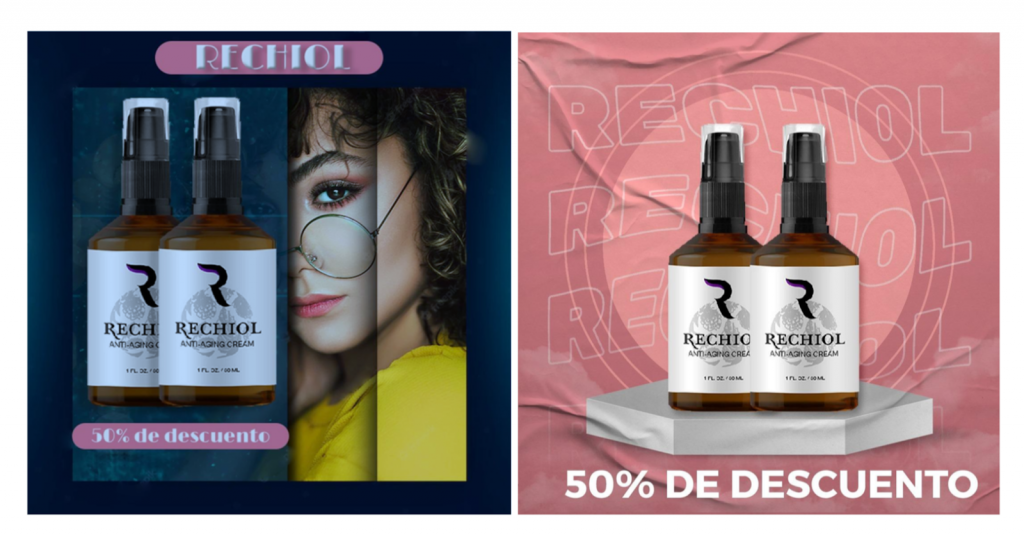
Five creatives in total were tested considering FB’s policy to avoid bans (and the white hat approach was used again). Here are the pics with the best results:

3-%D0%BA%D0%B5%D0%B9%D1%81%D0%B0-1-1-1024x535.png


The campaign was optimized by the following objectives: exclusion of those who had already bought the product, a $30-daily budget limit , and use of the creatives with the best performance.

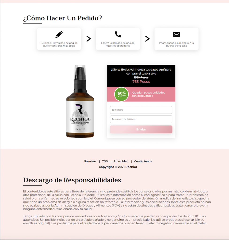
Screenshot of the landing page used:

%D0%9A%D0%B5%D0%B9%D1%81-%D0%BB%D0%B0%D1%82%D0%B0%D0%BC-1-929x1024.png
%D0%9A%D0%B5%D0%B9%D1%81-%D0%BB%D0%B0%D1%82%D0%B0%D0%BC-1.png-2-1-976x1024.png


*AdCombo comment: we also advise you to take a closer look at this page. Our affiliate created it neutral, without clickbait statements and semi black hat approaches. Everything is nice and trustworthy.

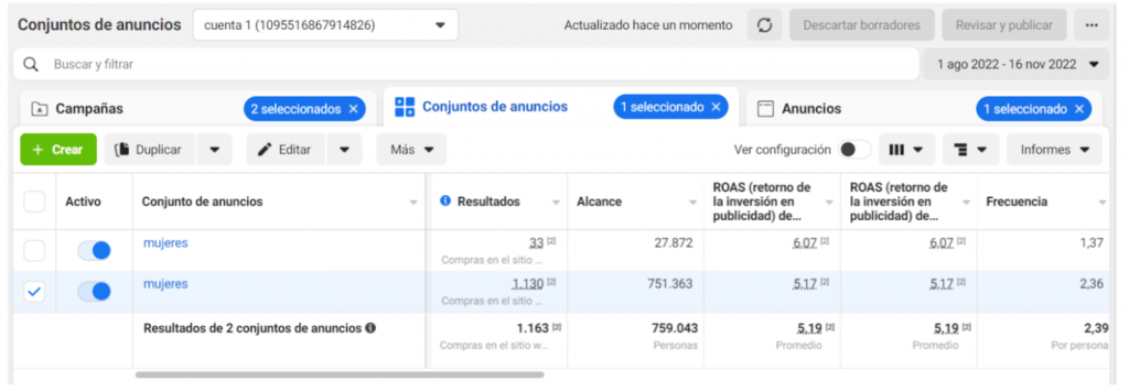
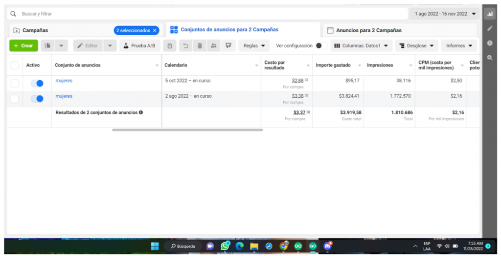
Statistics:

%D0%9A%D0%B5%D0%B9%D1%81-%D0%BB%D0%B0%D1%82%D0%B0%D0%BC-1.png-2-1.png-3-1-1024x355.png


%D0%9A%D0%B5%D0%B9%D1%81-%D0%BB%D0%B0%D1%82%D0%B0%D0%BC-1.png-4-1-1024x524.png


And we’re so close to the third case study, which has a different source of traffic.

Case study #3

Rejuvenating serum on push traffic in Chile and ROI 202%

Offer: 9218 Inno Gialuron – CL (the offer is in stop now, to find a suitable analogue, contact your manager)

GEO: Chile

Period: 04/02/2022 – 08/07/2022

Traffic source: Zeropark (push traffic network)

Revenue: $1910.50

Spend: $632

Profit: $1278.5

ROI: 202%

What’s interesting this time?

The offer was picked from the Top offers, just like in the previous two cases. Affiliate chose it as skin care products are in high demand in Chile.

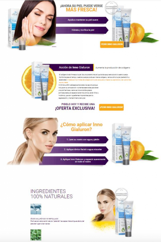
And to make sure the landing page was the right choice, he checked out its adaptability to mobile phones (which is really important nowadays):

%D0%BA%D0%B5%D0%B9%D1%81-11-1-684x1024.png


In addition, our responsible partner altered some words on the landing page, translating them to the local dialect for better perception by residents. He also added a section describing the ingredients and how to use the product.

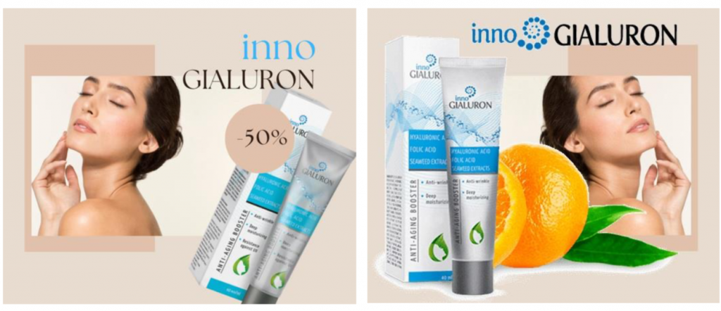
After setting up the postback and API, everything was ready to start. The budget limit was $4 per day and 2 creatives were selected:

%D0%BA%D0%B5%D0%B9%D1%81-12-1-1024x442.png
How about the optimization?

One of the benefits that ZEROPARK provides is that the campaign can be easily optimized. One can apply rules that will automatically pause the sources not giving conversions and increase the budget in sources with a good CR. This automates the optimization process and improves campaign performance.

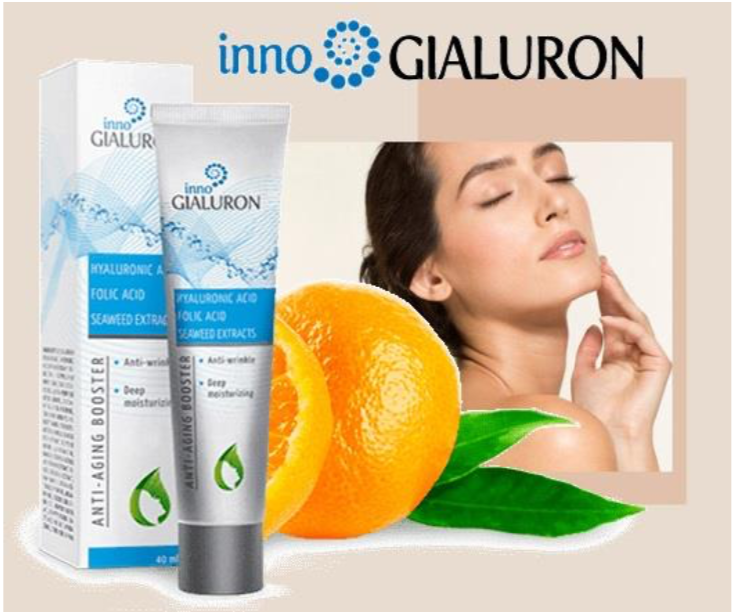
The affiliate found out that simple creatives brought better results. So the highest CTR was here:

%D0%BA%D0%B5%D0%B9%D1%81-13-1.png


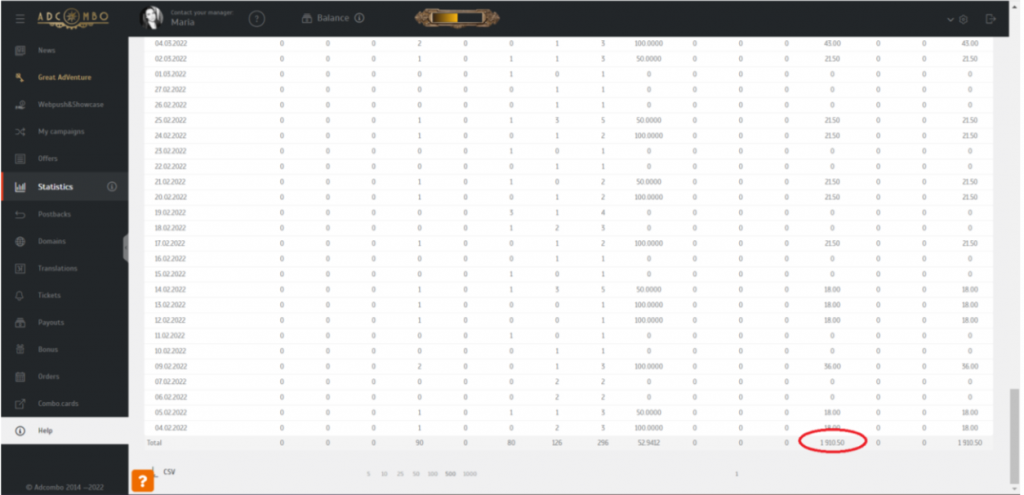
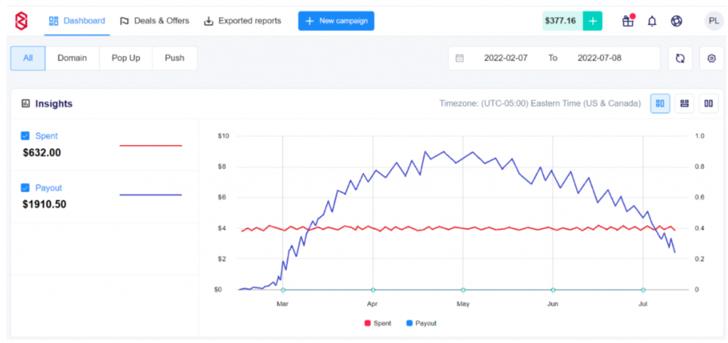
Here are the screenshots of the campaign statistics:

After almost 6 months of being active, the campaign generated 46274 clicks, which converted to 296 leads that turned into 90 sales.

The commission per sale was $21.50. The campaign brought revenue of $1910.50. The spend was $632, and the profit was $1278.50 with an ROI of 202%. It was a very profitable campaign.

%D0%BA%D0%B5%D0%B9%D1%81-14-1-1024x495.png


:cool: Tip: It’s important to give the campaign time for optimization. It always starts with a negative result (as shown in the screenshot below).

%D0%BA%D0%B5%D0%B9%D1%81-15-1-1024x483.png


It is a big mistake to stop the campaign at this point. Affiliates need to be patient and let their campaigns gradually improve. Over time, the revenues will exceed the spend! You’ll see it!

Conclusion

To sum up three case studies:

Clear and white hat approach can give great results!

The author of the case study, who got more than $35k in profit with1-year-old campaign, had only two FB ad accounts. And the second affiliate avoided bans by having a fine creative-designing strategy.

That’s how consistent work, a delegation of tasks, and different approaches to optimization along with scaling up can bring results for several months or even a whole year without any tricks!


Wish you more converting ad strategies!
 
1200x630.jpg

We are glad to establish a private club for the top affiliates and the best AdCombo partners - Grand Ad Society! Access is by invitation only. Only affiliates with the most quality traffic can be invited!

On June 1, 2023, we're launching an exclusive Challenge for the top affiliates. Till August 31, 2023, the best community members with the most impressive traffic volumes will compete for luxury prizes.

Rolex Datejust 41mm is a guaranteed prize for the Top-1.

Top-5 participants will compete for the money prize. Its amount will be formed based on the total number of sales.

The winner is picked not by traffic volume, but by its quality. The higher the traffic quality and percentage of buyouts - the more chances to prove your superiority and take the Grand Prize.


We will gladly follow the incredible competition of the strongest affiliates! :cool:
 
1200x630.jpg


This spring, we released a lot of helpful and exciting content! To avoid losing yourself in the info flood, we’ve gathered everything in one place and sorted it, so you can quickly find what you need the most!

Well, just choose the right category for you:

For Beginners

The third video tutorial on AdCombo interface is available! – AdCombo

Tutorial video on the AdCombo interface. We’ve shown you how to set up the postback, pixel, and the API. In the post, you’ll also find a link to the previous video, where you’ll learn how to set up a campaign in AdCombo and create a tracking link step by step.

The Beginner’s Journey: How a PR Manager Started Affiliate Marketing. Part 5. Campaign Launch – AdCombo

The 5th part of the unique project of our PR manager Victoria, a.k.a. PR-fire Vi!

Victoria explained how to choose the best creatives, add an offer and campaign to the tracking software as well as how to check whether the postback link works the right way.

We highly recommend reading this article to everyone who is making the first steps in affiliate marketing!


For those who are already in the niche

Reducing Trash Orders in Latin America with the Hints by Advertiser – AdCombo

Our trusted advertiser shared some helpful info on how to reduce the number of trash orders in Peru and how to avoid them! We advise reading it to anyone working with Peru and LATAM.


This post is about a new TikTok tool – Keyword Insights (like a spy tool but totally FREE!). The service will help you find ads on TikTok by keywords (phrases are sourced from voice-over audio, text overlays, and caption/description texts of ads). Working with TikTok and never tried it? It’s the time!


For inspiration

Interviews with AdCombo’s Top Affiliates. Emotions, Stories, and Bright Impressions from The Great Adventure Grand Finale! – AdCombo

After the Grand Finale of The Great Adventure Challenge, we interviewed Top-5 and Top-50 participants. They told us about their hard path to their goals and the moments when they understood it was not gone through in vain!

Want to recharge your motivation like in a sports drama movie? You’d better read our article via the link. Believe us, the suspense is the same! ;)


Maximum benefits – minimal time spent!

The list of useful reels on our Instagram:


Choose the content that fits you the most :cool:
 
Last edited:
A lot of sunshine, outdoor activities, and a great time with the best partners!

Check out our first day of The Great AdVenture Challenge Grand Finale!

May your summer be just as amazing! :cool:


The Top Offers list is now available again!

1080x1080.jpg


It's 3 a.m. and the inspiration to launch a new campaign does hit you? Have no desire to guess, and just need the best offer to launch? Your manager is already out of touch, what to do? :rolleyes:

We’re reviving the Top Offers list for hardworking affiliate marketers and not only!

Every month, we'll post the best offers based on the approval rate, so you can earn more without needless searching. :cool:

1080x1080 Оффер 1.jpg


1080x1080 Оффер 2.jpg


1080x1080 Оффер 4.jpg


1080x1080 Оффер 5.jpg


1080x1080 Оффер 3.jpg


1080x1080 Оффер 6.jpg


1080x1080 Оффер 7.jpg


Need more offers, but waiting the next Top list is not a fitting option?

Our Telegram bot is ready to help you find the most suitable offer 24/7. Thumbs Up
 
The Grand Finale of the Grand Challenge!

The list of the lucky ones who took part in the Grand Finale of The Great AdVenture Challenge included only a chosen Top-50 affiliates.

Of course, many more affiliates wanted to immerse into the atmosphere of that luxury and inspiring night! And you have the chance to do it right away! :cool:

Feel the emotions of the Great AdVenture gala night:

 
Approval Rate: What it is, How to Calculate and Use It
1200x630.jpg


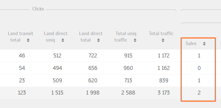
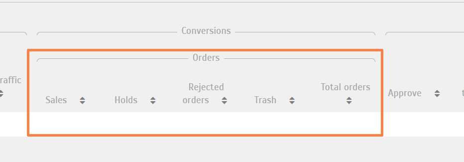
When a customer comes to an AdCombo landing and fills in the order form indicating their name and phone number, an order is generated in the system, and we’ll initially see its Hold status in the statistics.

When the call center agent calls the customer, and they confirm the order (confirm that they want to buy the product), then the order gets verified. It appears in the system (Statistics) as Sale.

Screenshot_4.png

Approval rate – how to calculate it?
The approval rate % of an offer is the number of confirmed orders over the total number of orders that the offer receives in a given period of time.

Approval Rate % = (Sales/Total Orders)*100

If an offer has an approval rate of 40%, it means that out of 100 people who filled in the order form on the landing page, 40 people confirmed the purchase during the call. Later, in the statistics, the affiliate will see the payouts for those 40 orders in the balance section.

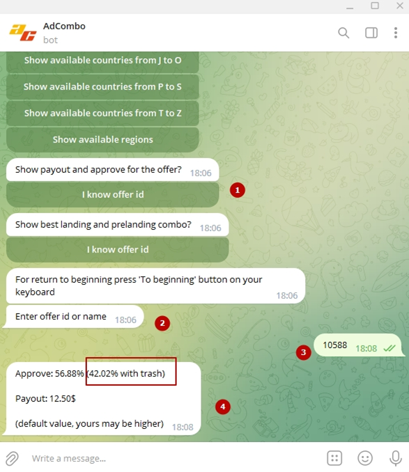
You can use our Telegram bot to check out the AR % of a COD offer:

unnamed.png

Why the AR % data is important to know?

When the Approval rate on the offer is about 15%, this means that 85% of the orders got the statuses Rejected or Trash. Then you should buy cheap ads to ensure the profitability of your campaigns. Organic traffic is also a fine option for this type of offers.

Low AR (but there is a solution!)

Note that there are offers with low approval rate that still receive monthly sales, since affiliates drive cheap yet quality traffic to them. So, you can also set up a profitable campaign even for an offer with a low AR if you get low-cost traffic (and personally have a high AR on the offer). It usually happens to Adult offers, for example.

High AR

If the approval rate of the offer is 35% or higher, it means that the offer is well- approved, and many customers confirm their purchases during the call.

Screenshot_1-1-1024x263.png

How are affiliates paid for sales?

Let’s say you launch a campaign on Facebook. The offer has an approval rate of 40%, then you have 1000 visits on your landing page. About 100 people out of 1000 complete the form for the call center, they want to buy the product and the price seems good to them. Before they will be called, we still have no orders in Rejected or Trash columns. Our 100 orders are in Hold, so orders that are in Hold = our Total Orders for now.

Screenshot_3.png

In the statistics, you see 100 in Hold (and in the Balance tab as well). Then the call center agents will call those 100 customers (usually during 1 day). If 40 out of 100 customers confirm the orders ( i.e. want products to be sent to their home addresses to pay for them on delivery – COD model), the rest 40 orders will be moved to the Rejected or Trash columns. Later, the call center will pass the info to AdCombo that those 60 records are confirmed, and you will see them in the statistics as Sales (40 Sales for COD offers).

The payouts for them will be displayed in the Balance section next to your manager’s picture in your account.

Screenshot_5.png

When you ask for the payment from those sales, we’ll check how many of those 40 people have received the purchase via delivery to the address (this data isn’t seen by affiliates, only by the managers). If none of 40 people accepted the purchases on delivery (pay for them), then the traffic is considered fraudulent, and the affiliate doesn’t get the payout. If most of 40 or all finally buy the products, then we can pay the sum under the Available title.

To resume

  • 1000 people visited the landing page
  • 100 people filled in the form for the call center (The sum that will be paid for sales is in Hold)
  • 40 people confirm the orders during the call (Payouts are added to the Balance as Available)

giphy.gif
Delivery

Case A: 38 people bought the product (the affiliate is paid for 40 Sales)

Case B: 0 people bought the product (fraudulent traffic, the affiliate isn’t paid for the orders).


Calculating campaign’s performance

To optimize your ROI, pay attention to the cost of each lead out of those 40 you pay to the traffic source.


Here are two helpful formulas:

X (Cost of traffic to get Y customers) / Y (the Number of customers) = Cost of 1 customer.

$ (Payout for the offer) – (Cost of 1 customer) = Profit.


Example:

  • You paid FB $300 for 1 campaign for 1 week
  • 1000 customers visited your landing page
  • 100 customers filled in the order form (Hold in Balance and Statistics)
  • 40 customers out of 100 confirmed the delivery during the call
  • (Out of payouts for 100 orders in Hold, only payouts for 40 orders became Available).
  • Available Balance = $ (Payout for offer) x orders [40] = $12 x 40 = $480
  • Out of 40 customers, 38 people paid for the product on delivery, the rest 2 changed their minds when the order was delivered.

    AdCombo paid for 40 sales.

    Available Balance = $480.

Campaign’s performance: $480 (Income) – $300 (Spend) = $180 (Profit) you are earning $180!


giphy-1.gif


Hopefully now you have a better understanding of these important metrics, and they will help you make big money with AdCombo (and calculate it right)! :cool:
 
WE UNLOCKED NEW GEO - MEET BRAZIL!

1080x1080-1.jpg

This day has finally come!

We’re truly proud to announce you this news. And now we’re gladly showing you the path to the hidden profits that are calling for you!


Brazil is available for every AdCombo affiliate, yet there are little lead cap limits for the offers. Don’t dance lambada too long before rushing for them first!

2 mins before starting - have a cup of a fine Brazilian profit-flavored coffee and discover why Brazil is your unrevealed CPA treasure!


Opt for yours: seize the chance, go for it, or skip it.

We’re still keeping some lead caps for you! ;)
 
1080x1080 Обложка Англ.jpg

We know what can make you happy, even if you only "get tanned" in front of the monitor.

The second month we're gathering offers with the best approval rates! So you can forget about unnecessary expenses on tests and set the money aside for an unforgettable summer adventure!

Wow! For super affiliates, we've prepared a high profit-degree promotion. With it, you can make good profit not only in the moment, but even in the future!


You have ONLY 10 DAYS to launch a campaign for 35628 Matcha Suri - CR and get a higher payout for quality traffic. If you're fast enough, you’ll be able to spend a vacation with it, and also at least all year round.

1.jpg
Click

2.jpg
Click

5.jpg
Click
photo_2023-07-13_16-51-29.jpg
Click


photo_2023-07-11_13-29-30.jpg
Click

3.jpg
Click

6.jpg
Click
7.jpg
Click

Hey, CPA hero, we’ve thrown a great plan of action into your pocket, what's next? :cool:
 

Attachments

  • 4.jpg
    4.jpg
    1 MB · Views: 23
Last edited:
Still haven't joined our new channel with payout bumps and bonuses? What a big mistake for your budget! :eek:


photo_2023-07-07_18-45-33.jpg


The first post with a list of new hot and juicy offers in rare GEOs and with good payouts is already in the channel.

Follow us to make sure you will get all profitable updates immediately! :cool:
 
8 ways to cope with stress easily!
Affiliate routine is full of stress that may reduce the effectiveness of your work. Time to read about some techniques that will help you relax and get more productive!

photo_2023-07-21_17-39-39.jpg

adcombo_post_83875_stress_en_1080x1080_instagram_01 (1).jpg


adcombo_post_83875_stress_en_1080x1080_instagram_02 (2).jpg


adcombo_post_83875_stress_en_1080x1080_instagram_03 (1).jpg


adcombo_post_83875_stress_en_1080x1080_instagram_04.jpg


adcombo_post_83875_stress_en_1080x1080_instagram_05.jpg


adcombo_post_83875_stress_en_1080x1080_instagram_06.jpg
 
List of the Best Offers of July’23

2.jpg

It’s time to go traveling! The last month of summer is really the time for it. And if you can’t leave your favorite place by the monitor – we invite you to a virtual trip around the world: just you, traffic and profitable campaigns!

We’ve made a new set of offers with the best approval rate in July.

If you’re looking for “this exact offer” or want to test a new region, just go through the pics!

1.jpg

Link

2.jpg

Link


3.jpg

Link


4.jpg

Link


5.jpg

Link


7.jpg

Link


6.jpg


Link

Want more? :cool: Our bot - AdCombo will help you find the most suitable offer on your request. Contact it freely without looking at the clock or the day on the calendar.
 
1200x630 ����.jpg


The most important indicator of effective cooperation for an advertiser is the number of buyouts among confirmed orders of an affiliate.

Buyout, or a completed sale, is when the customer pays for the product on delivery.

Although on the COD model affiliates are paid after the lead confirms the order by phone, the percentage of buyouts from these orders shows how effective the cooperation is.

So what can affect the buyout rate?
Right targeting!

Sometimes finding the right targets is like walking around a playfield with dynamites and chests of gold o_O

But what if we tell you we have a map with all the chests marked?

We’ve requested information from some of our leading advertisers and
created a map with the best buyout zones to target.

For now, it’s available only for some offers in LATAM.

Usage instructions and the map are ready for you on the page >>> Zones with the best % of buyouts to target in Latin America

Get the doubled advantages from one campaign! Thumbs Up
 
photo_2023-08-23_18-29-20.jpg


No more waiting for an answer!

It's time to test the new AdCombo bot features. Get in: AdCombo

The bot has studied the entire AdCombo knowledge base, and you can ask it anything: how to calculate conversion, what API is, how to set up pixel and postback, how to request payouts, and much more!

But that's not all!

The bot will promptly send you a stop of the offers you're currently running traffic to. You need to enter your Telegram in your AdCombo account and link your Telegram account token from the settings to the bot. And don't forget to check the notification settings, "I want to receive news about offer changes via telegram."

Click on the link to get acquainted with the new features right now! ;)
 
00 (1).png


Productivity is a crucial factor in improving your skills in affiliate marketing.

We’ve collected TOP-7 tips that will enable you to reach your goals faster and joyfully!


01 (79).png

02 (70).png


03 (41).png


04 (31).png


05 (15).png


06 (9).png


07 (6).png
 
Landing Pages in Affiliate Marketing. From Beginner to Pro Level

1200x630.jpg

We are launching a short series of articles about landing pages. We’ll start with the theory, and in the following parts, we’ll do a practical analysis of AdCombo landing pages. Don’t forget to like it if you are interested in this topic!

The first part will help you to structure the landing page blocks, prevent possible mistakes, give you some ideas for A/B-test, and tell you about decision-making mechanisms.

Let’s start!

We’re going to talk about landing pages! Their major purpose is to drive Internet users down the marketing funnel and motivate them to leave their contacts in the form. This is how the sales magic works: an average viewer turns into a really valuable lead.

For your convenience, this article is divided into three levels.

Junior level. Here we’ll cover the essential base. It’s suitable for those who have just opened the door to the niche and are still learning the main things.

Middle level. Here we’ll share helpful tips for those who already have experience in launching ad campaigns but still need to learn some key points.

Pro level. If you are an experienced affiliate, you have seen everything, and nothing surprises you – go to the end of the article! There you will find the info beyond affiliate marketing and learn facts about the psychology of perception and how to influence decision-making on a subconscious level.


Basic level

Let’s start from the beginning. What exactly is a landing page? What is it for, and why is it so important?

A landing page is a website consisting of a single page. It is easy to create. And it perfectly manages its main function – to lead people to the target action. Most often, it is to purchase a product by filling out a form.

In fact, the types of target actions can be different. It depends on the selected offer. For example, leave contacts in the form, download an app, sign up on the website, etc.

Whatever your goal is, the landing page should grab attention and encourage a person to take action.

What is the key indicator of a landing page to track?

The conversion rate is considered to be the most important indicator.


The calculation formula is simple:
960x720 формула.jpg


How to determine a good CR?

According to WordStream’s source, the average conversion rate of landing pages is around 2.35%. A quarter of the top LP had it at 5.31% or higher. And the highest-ranked one-page websites (the best 10%) had an average CR of 11.45% or higher

Perfection is hard to achieve, but you can strive for it! What to do about it?

1. Design a clear structure

The first screen should be clear to the customer. Check if the product name is easy to read. Product photos should be of high quality. You can add a brief description of the offer and a CTA button. This button takes our visitor straight to the form-filling block. If the potential buyer belongs to a hot audience, he/she doesn’t need an additional product description. He or she already knows the pros and cons and came in to buy right away. The best thing you can do is to ease the customers’ path on the way to check out.

Next, place a block with a description of the product’s benefits. Try to specify here a unique selling proposition (USP) of the product. Well-designed USP will be a nice addition, but remember that the main thing is ease of use. When the text is placed on a beautiful picture but is impossible to read, no one needs it. Buyers refuse the purchase when it is hard for them. A minimalistic and clear UI is better!

Then add a trust indicators section. It often includes customers’ feedback. It will help make a quicker decision. Also, you can add a block about safe and environmentally friendly manufacturing and product quality certificates. Especially in Tier 1 countries people care about the quality and safety of goods.

At the end, place an order form.


Tip: Make as few blocks to fill as possible. And add hints for the users, making the ordering process simple.


Mark mandatory fields with asterisks, and make masks that will tell people how to correctly enter a phone number or email. If possible, make buttons or drop-down lists instead of manually filling fields.


Tip: ask someone you know (better not related to marketing) to fill out the form and see how quickly they can do it. What problems did they have filling it out? What questions they had, and what wasn’t obvious? Find some difficulties? Fix it asap!


2. Know your TA

To sell someone a product you should understand people’s needs and desires. These are the basics, without which it is impossible to close the sale.

What to write in the product’s USP? Should there be a section on eco-friendly production? Does the description text need a bigger font size (relevant for seniors)? Is it worth placing NSFW adult pictures right on the first screen? Can this picture of a person in a white coat be used?

Analyzing the target audience, its age, gender, cultural characteristics, devices, and time of purchasing will help to close most of these questions.

We hope these tips will help you to create a well-structured LP. Let’s move further to the middle level.


Middle level

For those who have already made more than one landing page, we will provide statistics and tips to improve landing pages’ CR.

What to do if traffic seems to be from a quality source, but, for some reason, there are no orders, and all leads end up in the thrash statistics column?

Do you need to change the offer? GEO? Complain to the affiliate manager about the advertiser, who does not give payment for seemingly “quality traffic”? Run to another CPA network with thoughts: “Now everything will go as it should”?

Or maybe you should study and improve your landing page?

When did the user leave the page? Maybe he didn’t understand where to click? Or entered the wrong number but the form accepted it?

Haven’t thought about it yet?

In this case, it is better to take a deep breath and calm yourself. Then start to check the efficiency of your LP.

The most common way to check the correctness of the improvements is split testing or A/B testing (they are the same things).

To implement it, you need to go through several steps:


  • Define the purpose of testing;


  • Formulate a hypothesis;


  • Important: it is better to test one thing at a time. It is useless to put several hypotheses into one test and then try to find out what exactly led to the better results;


  • Specify the desired values;


  • Run the test;


  • Analyze the results.

But this can be completely useless and costly if you act blindly. What to rely on when looking for ways to improve? Of course, on analyzing statistics. Each step in testing should be based on specific figures.

What to check in the statistics?

  • Number of visits
  • Number of conversions
  • Average time spent on the website
  • Page load speed
  • Users devices
  • Bounce rate
  • Heatmaps
  • Webvisor

All these tools will help you to analyze when the user leaves the page and does not reach the target action.

Of the non-obvious but significant mistakes can be found:

  • Non-obvious CTA button: small/ unclear text/ unnoticeable color/ blends into the background/ not clickable;
  • Many customers use mobile devices, but the landing page is not adapted for them. The user finds it difficult to navigate and refuses to order. Maybe he can’t hit the button because the clickable area is too small;
  • Long loading time. The size of pictures/ gifs/ videos and animations should match the internet speed in different regions. It is better to compress all files to the smallest possible size without loss of quality;
  • Problems with form filling. There are no hints, masks, or mandatory fields/ it is impossible to fill out the form using a phone/ it is too much to write in fields/ the buyer can write down an incorrect phone number, but the form will accept this answer anyway, etc.

What services can help you collect statistics:

For example, Google Analytics, Yandex.Metrica, Hotjar, Roistat, and others.

You can always share helpful services in the comments!

And what website builder can be used to create LP?

There are so many services. Here are some of the most popular ones:

Tilda, Wix, uKIT

We will also be glad if you share useful services in the comments!

And we move on to the next section…


Pro level

At this level, we want to go a step higher and talk not about landing pages themselves, their structure, and statistics.

It’s time to talk about equally significant related topics.


Psychology of color

You’ve probably noticed that different colors can subconsciously evoke various feelings and emotions.

Here are some examples of the connections between colors and the feelings they can evoke.

960x720 Инфографика 1.jpg


As you can see, colors that are close to each other can have similar influences. To choose the right palette for your ad creative or landing page, you need to first determine what emotions you want to evoke in your audience. Then choose the right color, its brightness, and saturation.

But don’t forget that color perception is a very individual process. The same color can evoke various emotions and impressions in different people. You shouldn’t expect the same reaction from all people from your target audience. But it is interesting to experiment with this topic. You can conduct a split test and write the results in the comments!

In addition, there is also a cultural aspect to the perception of color:


960x720 Инфографика 2.jpg


Finally, you can study the scheme of famous global brands’ logos to make sure that the color tool may be really helpful.

960x720 Инфографика 3.jpg


The psychology of decision making

Now let’s talk about how you can influence the buyer’s decision-making without being pushy.

The essence of this approach is not to force a product through changing the buyer’s way of thinking. But customize your content to fit the buyer’s habitual way of thinking. Remember: using psychology to manipulate customers is unacceptable!


Next, you’ll find a short list of 4 lifehacks, let’s go!


1. Tendency to constancy and consistency

Sales funnels are built on this mechanism. Each successive suggestion to a customer takes your interaction a step closer. People tend to keep their actions consistent. If potential customers have already started interacting with you, they are more likely to move on to the next step. Unless they became negative experiences of the interaction.


2. Tendency to establish points of reference – anchors

Humans tend to use the first piece of info as a reference point for subsequent decisions.

For example, when a customer sees that an item is now discounted, they:

  • First, he may think that it is a great offer;
  • Second, the cost and value of that good is higher.

The chances of how well this technique will work depend on a deep understanding of your target audience. What is the chance of such a user’s way of thinking?

If this is a working technique for your TA, you can offer the customer several options of product courses with different costs. Make sure to show how much money he/she will save depending on his or her choice.

But you should be careful with the enormous number of options, and that’s why…


3. The paradox of choice

If you give a customer too many choices, likely they won’t buy anything. There’s a parable about a Buridan’s ass (donkey) who couldn’t make a choice between two equally attractive haystacks. In the end, he starved to death, having never decided to choose one.

On the topic of landing pages, the page should have one clear call to action on the CTA buttons. If your goal is to close a sale – a button leads to the order form and does not dissipate the buyer’s attention.


4. Social proof

In new circumstances or when solving new tasks, people tend to follow other people and repeat their experiences.

In our case, this means that you need to take care of placing a section with testimonials. It will be better if besides the text you add photos of people. It generates more trust. And try to update the testimonials block.

If it is not possible to write reviews of several people, you can add a block with the total number of buyers. For example: “Our product has already been bought more than 1000 times!” This option will work as social proof too.


We hope you found this article helpful and your new lending pages will bring you a great ROI!
 
banners
Back